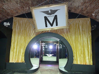
After feedback on the first logo design, I think I need to make the whole thing a bit bolder and develop the lettering slightly.
 |
| Making the eagle darker works well and look more suited for a night club. It looks dark and mysterious. |
 |
| Trying to further the type design, here it its overlayed onto my diamond vector. The bottom of the 'M' end where the bottom the diamond would. I don't particularly think this works very well as there is too much black going one and I don't want to introduce too many colours. |
 |
| I have come up with this for the type which I think works really well. The 'M' dominates the type like a mini logo and the smaller lettering spells out the name of the club. The illusion of symmetry pulls the whole thing together. |
 |
| Darkening and making the eagle slightly opaque helps the incorporate the background into the logo as well. |
|
|
|
|
The new logo designs: With variations of sizing and positioning it shows the versatility of the logo if it were to be used in different areas.
The darker theme makes it fit in a lot better with the club scene.


No comments:
Post a Comment