Friday 21 October 2011

Lookbook - Fashion Week Layout

Fashion Week is a major annual event across the globe so I am includin a double spread showing a very small snapshop of the highlights of three brands from three of the fashion capitals.

The layout has scattered images with text informing of cities and brands pictured. Lines run through the models faces to help enhance the clothing.


Here is the link of all the images I had to chose from.

http://www.harveynichols.com/hnedit/category/fashion/women/designer-focus-women/

I chose the images above out of the vast array there was because I thought they showed very different sides to fashion and not just the girly, floaty styles. Structure, framing, molding.

Lookbook - Womens, Mens and Beauty Edits


Womens, Mens and Beauty sections of the store will be promoted. Each section will contain the same information:

Editors Top 10
Designer Focus
Trend Alert

The trend alerts pages will be taken straight from the website. I will be doing this because I don't feel it is necessary to re-design these pages. They have already been designed very nicely and fit in well with the overall feel I want for the lookbook. They contain a lot of imagery and the layout I feel doesn't need to be improved.

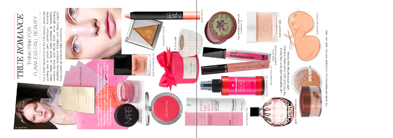
I have laid out the Editors Top 10 for each section to create a more visual representation of the information. Each Top 10 follows the same structure, running along like a timeline, with information running down about each item. The number 1 item is enlarged giving it the spotlight , with an upside down coat hanger holding the number. Having a lot of information on one page means that everything needs to be very clear and the use of grids helps to keep everything very structured.


Below are the layouts form the Harvey Nichols website regarding the Trend Alerts and Designer Focus for Women, Mens and Beauty sections. I have just rotated ad scaled the images to fit the paper size.


Brand Focus online shows a vast amount of different brands for all women, men and beauty. I don't feel it is necessary to include all of these because the lookbook is a snapshot of the Leeds stores key attributes. I have chosen a few to include and have designed simple layouts for each page.


The layout reflects the structure from the make up palette. It is all very 'boxed in' rigid yet feminine.


This layout has a lot of important information and therefore needs to be very clear and structured. The event is highlighted on the left hand side away from all the information. I have done this because people can see first what the event is and then if they are interested can flick to the right side for details of the event and places it is taking place.


The imagery here is very dark and seductive, so I felt the text had to mirror this. The launch is taking place in many cities, however because this lookbook will be featured in the Leeds store, this is most prominent date and time on the page.


This is a layout showcasing student and upcoming designers work. I am not sure about the layout. I don't think it works well with the rest of the theme of the book. And because the event will take place in London it isn't in the right place withing the book. Later on in the lookbook I will have a section on different countries to visit that have Harvey Nichols stores, I could include this layout there. I think I will redesign it though because it has;t been designed very well for the whole essence of Harvey Nichols.


For this layout as well I have just realised it is an event to take place in London. I may remove the layout altogether or slot it in later on at a more appropriate place.


Lookbook - Heading Sections


I have chosen to use the typeface used on the front cover for the lookbook title on my other title pages. I have chosen to have very plain title pages with a lot of white space to enhance the fact that this is the start of a different section.


Lookbook - What's In

What's in is a section showing brands and new products in store. Online there are simple images and type, so I have re-designed the spreads to look more interesting and more like advertisements and less like they are just plonked on a page.


Before 1


After 1
Picking out the main information, highlighting the brand and discount available. The type is left set reflecting the shape of the image.

Before 2


After 2
This layout is quite similar to the one online. Simple type and image, however I have chosen a more appropriate font with decoration to help reflect the design of the product more.


Before 3


After 3
Lines, structure and hierarchy. Cropped imagery shows a snap shot of the clothing and leaves things to the imagination still.


Before 4


After 4
Showing a generic make up brush helps to showcase all of the products not just focusing in on one.


Before 5

After 5
The information tells about the new products instore, alongside the design Giorgio Armani. Showing the designer an not the products is a conscious decision because the brand is so recognisable and respected there is no real need to show the products themselves showing the designer is enough for the customer to be intrigued and look in store.


Lookbook - What's On & What's In


There is a section showing what events are on in Leeds Harvey Nichols on the online website that I will be including in my lookbook. I have designed simple title strip to sit along the top of each page. The background is a crop of winter tree scenes with the titles layered over the top.  The writing is very elaborate and isn't necessary to be read it is just added information for the pages.

Lookbook Poster Redesign

There are a couple events in Leeds with Harvey Nichols that have already got posters designed for them online. I don't think they are amazing and I wouldn't say that they capture the essence of Harvey Nichols at all.

The first event is to raise money for St George's Crypt, a charity that provides support for homeless, vulnerable and disadvantaged people. A very good cause, but quite a disrespectful poster I feel. The poster shows a homeless man sat on the floor whilst in the background people in the background are having a fine dining experience. I understand that the poster is trying to show who they are helping and the enjoyable experience that you can have by helping them.... hmmm I'm just not sure this is the best way to show it. I feel it looks down on the homeless man as if to say..."look at that poor man, now look at what fun we are having". Ok rant over. So I thought I would redesign the poster to help capture the meaning of the event, and still have its cause at the center point.


The hierarchy I have used here makes you read the event and then the purpose of the event first. It shows a charitable event where you can help the less fortunate without looking down on them. The pastel and muted colours work well with the autumn season. The customer only needs to read the circle of information really to know the key information about the event, smaller text is used below for those who wish to find out more about the event.


This poster celebrates the 15th anniversary of the Leeds Harvey Nichols store. I don't feel the original poster makes a big deal of the event. There is too much unnecessary information that distracts from the most important and interesting information. The general consensus is that people will read small print if there isn't loads to read. Here the small print looks slightly like and essay and there is some vital information there that people might not read because there is just too much to read on a poster that may be looked at for 5-10 seconds. The colours, type and imagery don't look very luxurious and exclusive, I would say they would fit shops like 'Miss Selfridge' and 'Joy' better.


For my re-design of the poster I have only included the most important information so that people are more likely to read the whole of the poster. The use greyscale makes the whole poster look more demure and in keeping with Harvey Nichols. Simple information, simple self, explanatory image and simple layout, perfect.