As I have been looking at the Rose Bowl building where the lecture will be taking place these designs have tried to be sleek eye catching and also blend in with the building.
 |
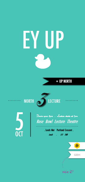
| Because the lectures are all up North I am including Yorkshire sayings for a funny spin. |
 |
| The layout is mainly type with block colour. |
 |
| The main information sits at the top and the date and times are in small print at the bottom; but still big enough to read. |
 |
| Lines reflect the construction of the Rose Bowl building |
 |
| Colours emphasis areas of the poster and dive it a depth. |
 |
| 3D effect of the Rose building window structure. |
 |
| Light, clean and fresh with dots of colour. |
 |
| Adding the triangle structure to the background make the poster more personal to the specific lecture being advertised. |
 |
| Aqua marine looks slightly too 'bathtime'. |
 |
| Type reading vertical emphasizes "UP NORTH". |
 |
| Needs more focus on the d&AD and GBH |
 |
| Eeys start at the bottom of the poster and read in order of hierarchy. Enough emphasis on the D&AD logo but not to overpowering. |