This module has provided me with an unlimited choice as to what I can produce and learn form it. Therefore it was key to pinpoint my umbrella statement and what I wanted and needed to produce in order to fulfill this.
Umbrella Statement:
An editorial investigation of high end retail with a focus on typography and print methods.
At the beginning of the module I was very interested in high end luxury publications, for example lookbooks and Ltd. Ed magazines. I hadn't ever produced a book to print and therefore I thought this an important time to further my knowledge on the area and so came about my Harvey Nichols Lookbook brief. Choosing such a high class and reputable company meant that realistically I could experiment with the most beautiful of materials and exclusive methods of production. I really feel I have learnt a lot from taking this mentality primarily because it steered me away from any other standard lookbook format. I experimented with laser cutting for the first time which helped give my work a whole new feel from that of previous years. Using this method made my work look more professional and true to what would be used in real life for the store. Using the laser cutter not only helped me with this project, but because of the wide variety of materials I tried, it helped me to understand how to the different strengths of laser, depth of material and density of stock altered the outcome and I feel this will greatly improve my knowledge and decision making for projects to come. For this project I also bound the book myself, I chose to perfect bind the book as I felt this would work best with the other materials I was using alongside. Binding a book for the first time was also a great learning curve for myself. Because my book was nearly 100 pages long I found it very hard to make sure all the pages were aligned correctly whilst gluing and stopping them from sliding around whilst they were drying. In conclusion to this brief I feel in future I would go to a professional for printing and binding so a more professional finish can be created, however I am pleased that I tried it for myself initially because I feel the hands on experience enabled met to get a deeper understanding of binding techniques than if I were to just send it away and disregard how it was being produced.
The initial brief the year group was set to get our brains working again for the D&AD talk in Leeds, I decided to turn into another larger brief. I felt the core design and idea had already been created, so I therefore decided to broaden my poster into event advertisement. Like the previously mentioned brief, I have never done a project for event design. Honestly, it wasn't something that I was very interested in primarily and in this instance it was a brief that was developed and designed without prior arrangement. There are so many aspects to event advertisement that I hadn't realised, you have to think about the whole journey of the event, from how people will hear about it in the first place, to leaving the event once it has finished. Every step that people take needs to be informed by design to create an experience for the customers. For this project I mainly worked digitally as the majority of the advertisement was very large scale and would have been unnecessary to print regarding its purpose and print costs. So, everything was mocked up digitally. Mocking a whole event up helped not only my Photoshopping skills, but also made me visualise and image the scenario, rather than having it put in front of me. Having been introduced to laser cutting I thought it would be a nice idea to design the tickets, which were to be printed onto pencils. This didn't really go to plan as the laser was just too strong to engrave onto the soft wood and went all the way through instead. Having done this and initially being fairly adamant that I wanted to create the tickets, I realised that in some cases it isn't necessary to produce everything, some things work better as a mocked up idea.
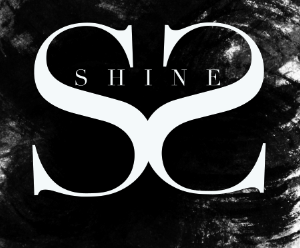
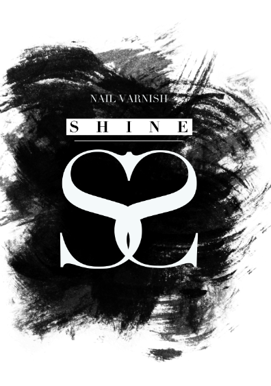
For the competition brief for YCN it was very open to interpretation and I really waned to create something different that would stand out form the crowd when being judged. The brief was to engage a younger audience with the Swarovski brand. Instead of having a simple advertising campaign with perhaps a younger tone of voice, I decided to design and produce a range of nail varnishes made with Swarovski crystals to open the brand up to a wider and younger market. This helped me look briefly at product design and the branding of it. Also, packaging design and advertisement campaigns. I didn't want the brief to stop just at the nail varnishes, it needed to be a well rounded product launch that would work in the real world. I experimented with spot varnish, foiling and sticker design to give the overall feel more luxury and sophistication. My aim with this brief was to keep within the Swarovski branding guidelines and to create something that would sit perfectly in their store windows. I am very happy with the results from this brief and my furthered knowledge and experience working with a luxury brand.
Charlotte Warren and I undertook a short collaborative brief re-designing the value range branding for Asda. This was a thoroughly enjoyable project and I feel we work very well together. Working with Charlotte meant that we were able to get constant feedback from each others ideas and therefore it was evident that the brief was moving much faster than if we were to have done it on our own. Our designs were highly concept driven, thinking about customer engagement and working as if this would actually be used. This enabled us to be very focused as to what we needed to create and the versatility of the design at every stage. We looked at packaging design and branding over a full range of materials used by the Asda store which showed how commercially driven we are. This project made us work to a tight brief, with tight deadlines and we are both very happy with the finished products.
Re-designing the Leeds Club Mission logo was initially a very short brief, however it kept expanding as my ideas kept flowing for possible outcomes. This brief helped me look at a different aspect of luxury design. Club design, and I felt it needed an update. This brief made me look at customer interaction with design and how it can change the mood and feeling of a place. I found this brief quite hard because there is already a very structured way that a club is designed physically and visually and I needed to try escape this mold. Also such a simple thing as lighting in the club made my design have to be a lot more visually engaging and readable in low lighting. Black against white and foiling helped me to make the most of the small amount of light in a club. Facet design became the core to my redesign as it relates to lighting and reflection, both key elements to club design.
This module really has helped me to gain experience in areas that before hand maybe I was scared or just apprehensive to use. I think it has set me in good stead for the final stint of this course and I now have a more structured idea of who I am as a designer and where I would like to be in the foreseeable future. The things I have produced for this project are all outcomes to experimentation and I feel it is key to fail before you succeed in design, because then you are forever improving and not just designing for designs sake.
I definitely think that my umbrella statement has grown and developed throughout this module and I would like to update it slightly to express my last module better and where I am going to continue to.
A promotional investigation of high end design with a focus on concept.

Wednesday 14 December 2011
Tuesday 13 December 2011

Saturday 10 December 2011
Nail Varnish Bottles Shapes and Colours
After looking at the wide range of nail varnish bottle shapes I can chose from on different packaging sites I have decided to go for a square bottle shape with a streamline square lid. The lid will be black with a white brush inside. The corners of the nail varnish bottle will help to reflect the light and crystals inside the bottle. Using a rounded bottle I feel wouldn't give as much of an edgy and relevant feel.
Regarding the colours of the nail varnishes for the initial launch of this range I think the colours should be simple and reflect the existing identity of the Swarovski brand. When the product has been launched for a while, then more colours can be added to the range to make it more versatile and accessible to a wider audience.
Initially I will be going for a silver glitter, crushed crystal filled clear nail varnish and whole crystal incorporated nail varnish.
They will look a little something like this from the outside:
 |
| Silver glitter |
 |
| Crushed crystal |
 |
| Whole crystal |


Subscribe to:
Posts (Atom)