What's in is a section showing brands and new products in store. Online there are simple images and type, so I have re-designed the spreads to look more interesting and more like advertisements and less like they are just plonked on a page.
 |
| Before 1 |
 |
After 1
Picking out the main information, highlighting the brand and discount available. The type is left set reflecting the shape of the image. |
 |
| Before 2 |
 |
After 2
This layout is quite similar to the one online. Simple type and image, however I have chosen a more appropriate font with decoration to help reflect the design of the product more. |
 |
| Before 3 |
 |
After 3
Lines, structure and hierarchy. Cropped imagery shows a snap shot of the clothing and leaves things to the imagination still. |
|
 |
| Before 4 |
 |
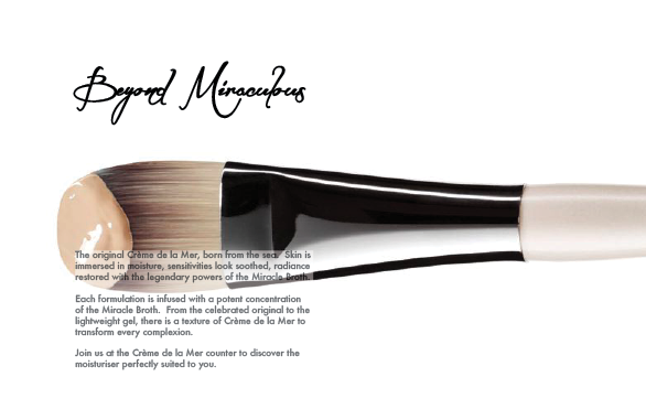
After 4
Showing a generic make up brush helps to showcase all of the products not just focusing in on one. |
|
 |
| Before 5 |
 |
After 5
The information tells about the new products instore, alongside the design Giorgio Armani. Showing the designer an not the products is a conscious decision because the brand is so recognisable and respected there is no real need to show the products themselves showing the designer is enough for the customer to be intrigued and look in store. |
|
|


No comments:
Post a Comment