
Showing posts with label Brief 4 - Value Range. Show all posts
Showing posts with label Brief 4 - Value Range. Show all posts
Tuesday, 13 December 2011

Thursday, 1 December 2011
Instore Application


Here is a quick application of the products instore to show how they would integrate amongst other products and if they would stand out.
I think they show a new way to package products by using a strong concept. They stand out against other brands because they are intriguing (because of the statistics) and make people take a closer look.
The cheapest of quality for materials would still be able to be used for these products and therefore still makes them able to be 'value' for the customers.
Final Packaging Range Comparison
I am really happy with the finished result and definitely think it is a big improvement from the Smart Price range that is currently being used. There is a real feel of concept and gives the customers to be intrigued with the products and an initiative to buy them.
The use of statistics interests the customer to look closer and see what the product is talking about. Also by telling the customer what is inside the product it gives them reason to trust the brand more as they are not trying to hide anything like additives and E numbers etc.
The change of name is a big step and if it were to be actually put into use instore there would need to be a big advertising campaign to initially introduce it. For this project we didn't focus a lot on the advertisement of the new products as we thought this was a whole new aspect which could be explored further in another brief.
The use of statistics interests the customer to look closer and see what the product is talking about. Also by telling the customer what is inside the product it gives them reason to trust the brand more as they are not trying to hide anything like additives and E numbers etc.
The change of name is a big step and if it were to be actually put into use instore there would need to be a big advertising campaign to initially introduce it. For this project we didn't focus a lot on the advertisement of the new products as we thought this was a whole new aspect which could be explored further in another brief.
 |
| Before |
 | ||
| After |


Individual Items Imagery
The concept behind our design means that all the products have their contents visible from the outside. Where possible we have used clear material so the products can be seen, for the other products that don't use transparent materials for their packaging we decided to print imagery of the content onto the packaging for the same effect. I think it turned out really well and gives the identity a strong and clear feel.
 |
| White card printed onto. |
 |
| Clear label over greaseproof paper. Would be printed directly onto paper in real life. |
 |
| Clear sticker printed into and placed onto cellophane. Would be printed directly onto cellophane in real life. |
 |
| As above. |
 | |
| Clear sticker printed into and placed onto bottle. |
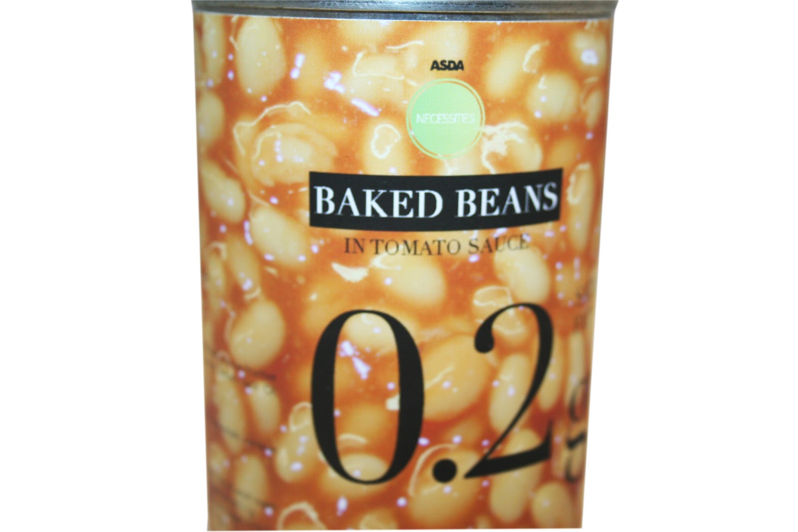 |
| White paper printed into and placed onto can. |
 |
| Clear label printed into and placed onto glass jar. Jar has been sprayed with frosting so that the writing is more visible because of the dark background. |
 |
| Printed sticker into glass jar. |
 |
| Plastic sticker printed into and placed into plastic tub. |
 |
| Matte sticker paper printed onto and stuck onto can. |


Tuesday, 22 November 2011
Value Range - Chosen Packaging Layout


The hierarchy is:
1. Number
2. Product
3. Fact relating to number
4. Necessities logo
All layouts have the type large on the page with text to the right describing the number shown. The name of the product is above the number in white inside a black box to highlight it. The Necessities logo is at the top adding colour to the layout. The logo is very small but the shape of the logo is very distinctive (circle with white text inside with Asda logo above) so the idea is that the logo doesn't have to be big for people to know what it is.


Subscribe to:
Posts (Atom)